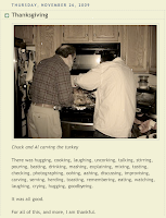
Here’s a screen shot of the post:
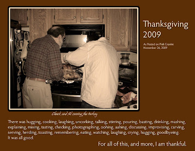
 Today I turned it into a Digi-Scrap Layout.
First I created an 11” x 8.5” landscape “paper” in Photoshop CS3. (I believe everything can be done in Elements.)
I named and saved it as a PSD file.
I also created a Text Edit or Rich Text File (RTF) of the same name where I chronicle the steps of a layout or photo manipulation.
I opened the photo of Chuck and Al carving the turkey and dragged it onto the blank paper.
I sampled some browns out of the photo using the Eyedropper Tool, deepened it and, using Paint Bucket, filled the background.
I then clicked on the photo layer and chose Edit > Stroke I adjusted the color to light cream and chose about a 20 pixel width Outside. I repeated the step choosing about a 25 pixel stroke in black, also Outside.
I then copied the text from my blog post, created a new layer and pasted it in.
For the text, I chose the same cream color as the first stroke on the photo.
I broke out the final line of text and placed it on its own layer.
I did the same for the title, caption and Pink Granite credit.
Finally, I added Drop Shadows of varying degrees to the photo and the text.
I switched on View > Show > Grid and using the Move Tool and the keyboard arrow keys, I oonched the various layers of text and the photo into what I felt was a pleasing alignment.
Once I was satisfied, I saved the file - as I had been doing throughout!
I used Image > Duplicate and saved the new file with COPY at the end of the name.
On that copy, I used Layer > Flatten Image and then saved it as a JPG file.
On my computer I created a new folder called “Thanksgiving 2009” and dropped the PSD file, the RTF file and the JPG into it.
Here’s how it turned out:

Original photo, manipulation and layout by LMR/Pink Granite. Fonts: Hypatia Sans Pro from Adobe and Hans Hand from DaFont. Software: Apple iPhoto ’09 & Adobe Photoshop CS3 for Mac.


3 comments:
This is just beautiful.. what a great idea - something special ;o) (Ronnie)
So cool and what a handsome couple of guys!!!! Carrie Merry Christmas!
Hi Ronnie -
Thanks so much! I'm happy you like it!
;o)
- Lee
Hi Carrie -
Yes they are - from any vantage point!
Merry Christmas!
;o)
- A.L.
Post a Comment