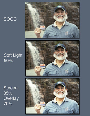
As I went through Jessica’s Shazam techniques, I couldn’t help but compare it to something I learned over on Ree’s website Pioneer Woman. Ree sometimes takes her SOOC (Straight Out Of the Camera) photo, duplicates it as a layer, then applies Hard Light and adjusts the opacity. That can give a very electric, almost overblown effect. For a gentler effect she recommends applying Soft Light to the duplicate layer. I’ve found that works very well, usually at a 50% opacity.
So what you see below is Chuck, a truly handsome and photogenic subject, standing on the side of the Cadillac Mountain Road in Acadia National Park in Maine. He is proudly holding his National Parks Golden Age Passport card, which he got when he turned 62. Our friend Gale up in Bar Harbor calls it his “Old Man's Card”!
The top photo is straight out of the camera - our old non-digital Canon SLR, of blessed memory. The middle version shows Ree’s Soft Light change. The bottom one shows Jessica’s Shazam technique. Oh and in the bottom two, I applied a narrow burnt edge, using a technique I learned from Ro Paxman over at Scrap Girls. I don’t have a link to the technique, but you use an Adjustment Layer for Levels, move the sliders to blacken out the photo. Then use the Rectangular Marquee Tool to set your edge and feather it (I used 5 pixels). Hit Delete and Deselect. You can then apply a Gaussian Blur to tweak it even further.
So which one do you like best? Yes, I agree. Chuck is adorable in all three. But look at his face, his hand and the waterfall behind him as you assess which version is your favorite. Thanks!

Just click on the layout to get a better look.
Layout by LMR/Pink Granite. Software: Apple iPhoto ‘08 & Adobe PhotoShop Elements 4.0 for Mac. Font: Helvetica
: : Update: Check out graphics wiz and author Claudia Snell’s comment on this post. She provides a nifty way to build on Jessica’s technique!


8 comments:
It was hard to choose 'cause I agree "Chuck is adorable in all three"! ...I'll have to go for the 50% soft light (the middle pic) since the clarity and detail in the pic stands out more... Hugs, xx
Cool stuff!
You can add some extra fun to this technique by adding a slight Gaussian blur to the "screen" layer and pumping up the brightness a lot on it. So, you'd end up with the bottom layer being the original, the middle one being a very brightened, slightly blurred version set to Screen or Overlay and the top layer being same as the bottom but set to Overlay or Multiply.
You have to play a lot and a huge array of effects can result from doing this sort of thing.
If you add a hue to one of the layers or even add more layers to the mix - the fun just never ends ;-)
It's the effect I've used on a lot of things to add a dreamlike quality like this:
http://flickr.com/photos/claudiasnell/155012690/in/set-72157594147801595/
and all of this set:
http://flickr.com/photos/claudiasnell/sets/72157594154048283/
I love playing with Photoshop :-)
Bearing in mind that you don't drink - are you sure that chuck isn't holding up the receipt for the worlds largest beer fountain that you have installed in your back garden?????
Couldn't resist it ;o)
Oh and No2 for me ;o)
holy crap when did Chuck's beard get so bushy? What exactly is he hiding under there?
:o)
Gail
BTW
# 3 shot is my 1st choice
Gail
Hi Lailaa -
I have to agree. They are all pretty close, but I like the middle pic best of all.
Thanks for the vote!
;o)
Hi Claudia -
Wow!
Thanks so much for the awesome tips and links!
The first link to the photo of your friend and his daughter is lovely!
The second link seems to be missing the last few numbers, but I'll wander around some more in your Flickr sets.
I can't wait to go play some more!
Thanks!
;o)
Hi Roo -
We both just about fell on the floor laughing thinking about the waterfall as a beer fountain! Imagine the crowds in Acadia if it were true!
Thanks for the vote!
;o)
Hi Gail -
Chuck's beard does look a little more wild than usual in that particular photo. It must have been related to his excitement over becoming eligible for his "Old Man's Card"!
Thanks for the vote!
;o)
- Lee
Hmm, I can't choose between 2 & 3, but if I had to, 3. I bet that beard keeps his chin walm in the wintertime!
Hi DMM -
Thanks for the vote!
It does keep his chin warm!
My late grandmother, Gagee, used to always ask me if I liked Chuck's beard. I would say "yes". She would shake her head "no"! Then Chuck would lean over to her and she would put her hands up to his face, report how soft it was and then chuckle!
;o)
- Lee
Post a Comment